top of page
Hello! I’m Rafael Hidalgo, an experienced graphic and user interface designer with a profound love for anything art and design. My curiosity pushes me to continuously learn and discover innovative creative concepts, tools, and techniques that push and develop my abilities.
I also love Legos, Hot Wheels, and Transformers.
UI Design
My previous projects I've worked as a user interface designer

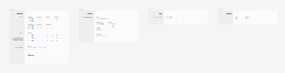
File Uploader
The procedure initiates as users hover over the drag-and-drop container, which presents instructions for uploading files in various formats. Upon completion of the upload process, an "upload in-progress" tab displays all uploaded files and associated alerts. Additionally, a separate tab labeled "upload history" allows users to review previously uploaded files.

Carousel
Developed a standardized carousel template within the content application, specifically tailored to showcase affiliate products.

Email Metrics
Within the Email application, an essential component involves metrics. The challenge lies in presenting these numerical insights to the user in a visually engaging manner while ensuring clarity and maintaining the intended functionality. Additionally, I developed a prototype in Figma to showcase the interactive features of these graphs.


Sign-in Page
Implemented a redesigned layout consistent with the established design system, incorporating a gradient background to align with the brand's visual identity.


Lightbox
Crafted a lightbox for an article page to illustrate its appearance, interaction, and functionality upon user engagement. This design prioritizes the presentation of vibrant imagery by avoiding text overlay, granting users an unobstructed view. Caption information is revealed only upon hovering over the image, ensuring a seamless viewing experience.

Main Menu
The objective here is to incorporate a feature in the main menu allowing it to minimize without disappearing entirely, ensuring continued accessibility for the user while maximizing the dashboard's screen width.

Picture Profile
For this task, I meticulously integrated existing components with new designs, creating a cohesive user flow. Through the use of high-fidelity mock-ups, I effectively communicated the intended interactions, facilitating productive discussions and leading to an optimized design solution for an intuitive user experience.


Wordpress Reimagine
One of my favorite projects at Organic involved addressing a common challenge faced by editors: difficulty in navigating the content creation process. To tackle this issue, I devised a solution focused on streamlining and reorganizing the tools available, aiming to create a user-friendly environment that allows editors to concentrate on content creation without distraction. By simplifying the interface and optimizing the toolset, the goal was to empower editors to focus on crafting engaging content seamlessly and efficiently.


Secondary Menu
I redesigned the buttons by incorporating icons and implemented a feature where the button title is only displayed upon activation. This was done to achieve a cleaner dashboard aesthetic with reduced text clutter. Tooltips are available to provide additional context when users hover over the icons.
old secondary menu
Content Design System
These projects encompass a vast array of content elements and components. I initiated the development of a design system and crafted numerous page layouts for content. Our primary objective is to establish a standardized layout design that is easily deployable for a swift launch. During my involvement in this project, coinciding with the emergence of AI, I developed an interest and decided to integrate ChatGPT and Mid Journey to create an article, employing it as a mockup.


E-Commerce
In my role at Livingly Media, I led the Livingly shopping e-commerce site design. This project involves close collaboration with a UX designer and a developer to build a comprehensive and engaging platform. My contributions include wireframes, color palettes, typography, visual design elements, and the overall user interface to ensure a cohesive and visually appealing experience.


Photostream Redesign
The main challenges in redesigning Zimbio's photostream page were to update existing elements without extensive coding, simplify user flow, incorporate ad slots, and maintain the integrity of the original design.


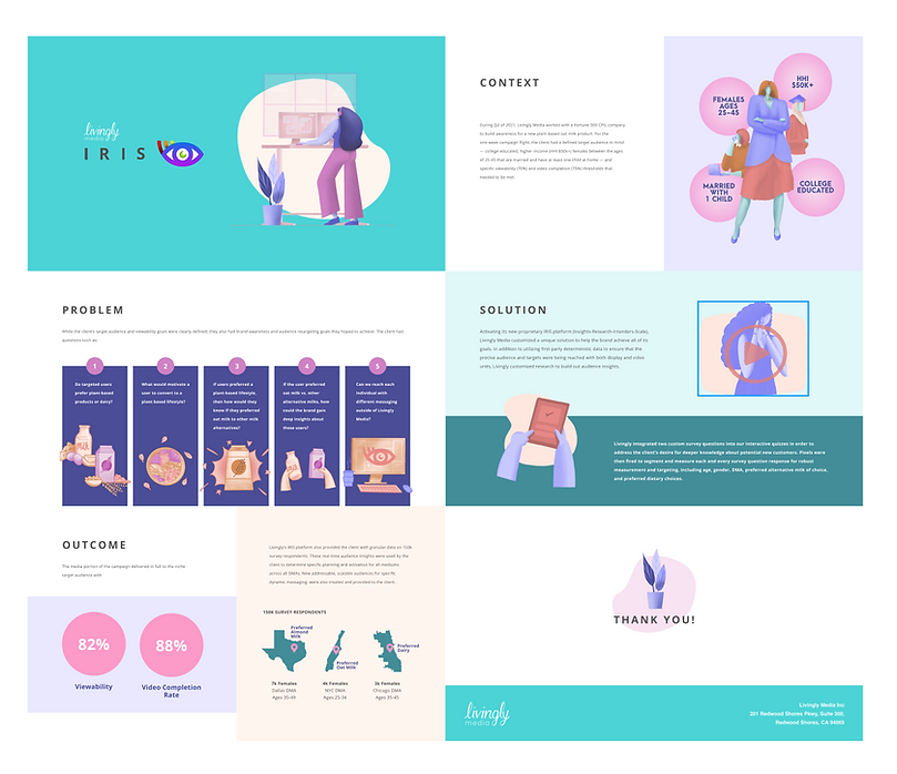
Iris Presentation Video
One of the tasks I've worked on is creating a presentation video for Livingly Media's new product, IRIS. My work process involved first mapping the workflow and user flow based on the brief I received. Then, I added visual design elements to support the copy and enhance the overall aesthetic. After seeing the entire picture, I proceeded to create a quick storyboard sketch to give stakeholders an idea of how the video would look and to gather feedback and approvals. I also created the Iris logo, slides, and one-sheet mailer.


Graphic Design
Some of the graphic design materials I have created.


Illustrations
Visual aids and editorial.


bottom of page